How to increase visibility with prospects by giving a more modern and dynamic identity ?
Clininfo
Custom E-Clinical Solutions
who is clininfo ?
ClinInfo is a service company specializing in IT management of clinical and epidemiological studies. It was created in 1998 and offers its clients the expertise and subcontracting of all aspects related to the studies, ranging from single-center experimental studies to large international multi-center trials.
The challenge
Clininfo wanted to refresh its brand identity with the redesign of their logo and their website. The website aims to increase visibility and successfully position Clininfo in front of their various target audiences, notably CROs, hospitals, medical services.
01.
REFLECTION & Concept
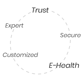
First tests, definition of the company's values
Company values
Inspirations
02.
CREATION PROCESS
Redesign of the graphic elements
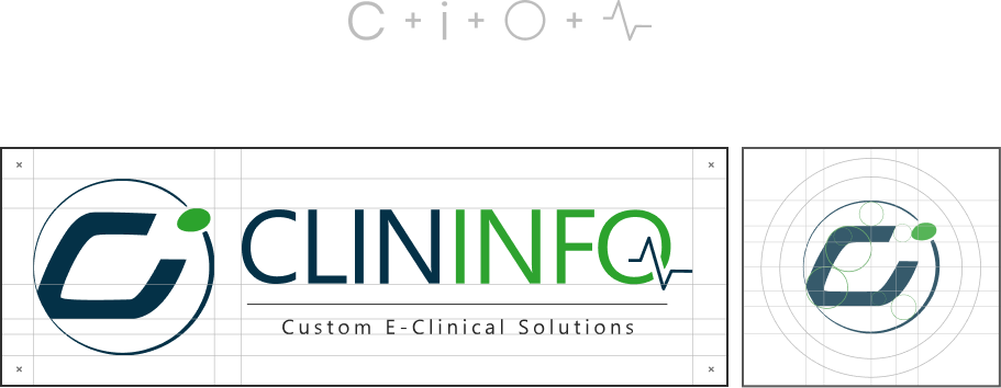
A modernizing logo
Clininfo wanted to resume and upgrade its logo. Its identity is mainly based on its professionalism and expertise in the field of E-health.
The colour palette has remained faithful to the original brand palette and has been balanced with a darker blue, a lighter green and a grey to support each information. The “CI” has been completely redesigned, a circle around it energizes the logo which refers to the support from A to Z that the company offers.
Professional,
Modern, &
Confident
Midnight blue
#043147
Medical green
#2EA32F
Elegant grey
#282828
The typeface was chosen to seamlessly integrate with their new logo and to modernize the brand, while maintaining links to the professional identity they have established through the years. I chose Segoe UI, a sans serif typography that reflects the values of Clininfo.
AaBb
Segoe UI
Regular
The quick brown fox jumps over the lazey dog.
Before
After
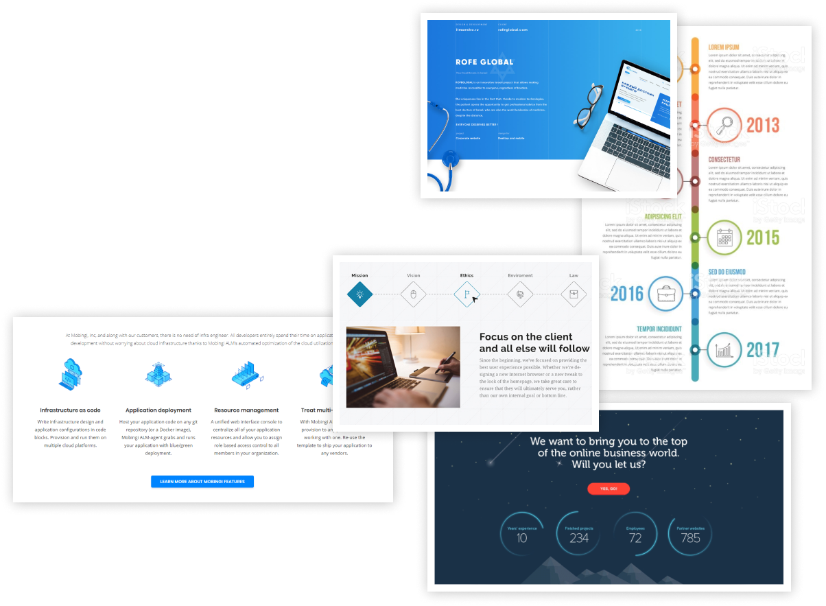
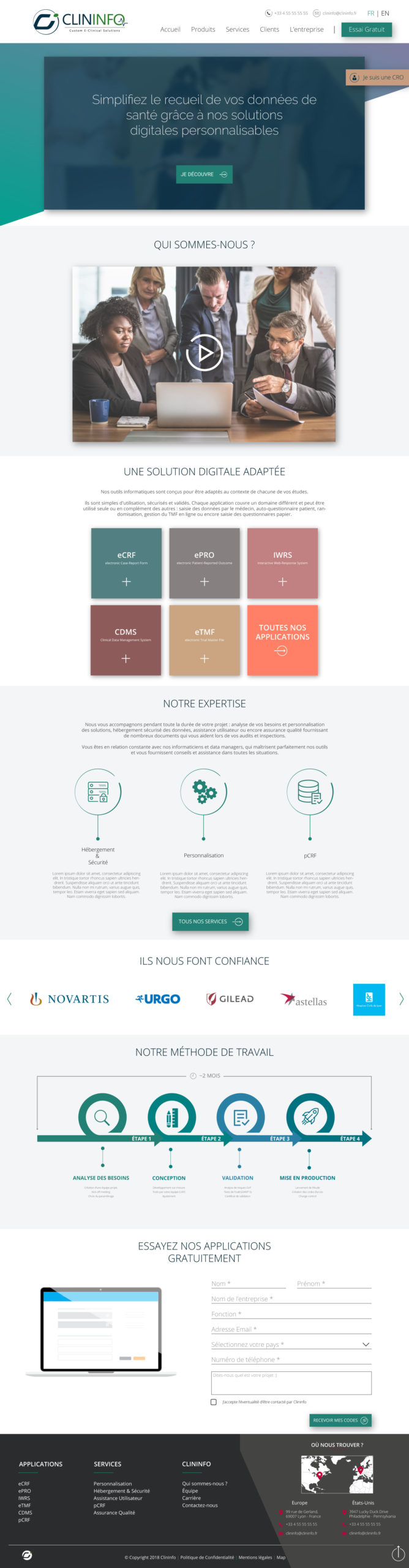
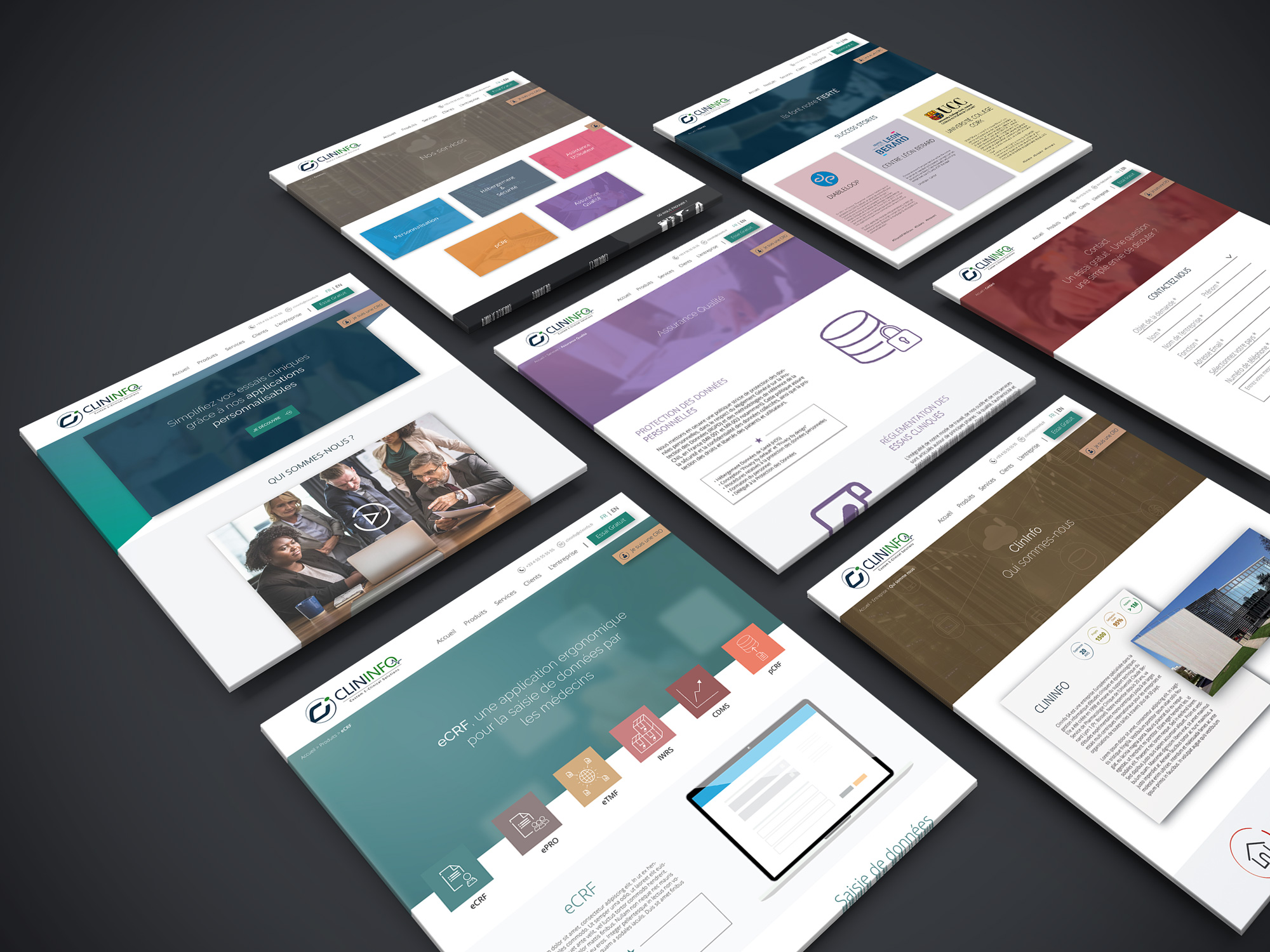
A website that comes back to life
Through the redesign, the main point was to bring a clear and intuitive navigation but also to add more flexibility, more lightness to the website in order to stand out from the competitors and avoid the "too professional" side.
Home
Clients
Applications
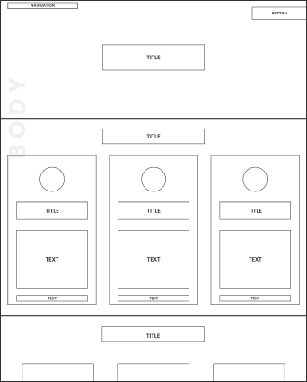
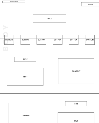
The approach
In addition to developing a modern web design, providing users with a seamless and fast experience were key targets. The user experience has been enhanced by restructuring the navigation to display more entry points, increasing user engagement and adding credibility to their first impression. Enriched with this, colours to mark each page of the site to effectively guide users to their destination.
To increase Clininfo's digital reputation, it was important to present the team, clients and services that they offer. In addition, the website has been optimized with informations highlighting all Clininfo's solutions, values and differentiators -- giving users an overview of all Clininfo has to offer.
Let's Do This.