Client
University Project
tasks
UX DESIGN, UI DESIGN, visual identity, MOBILE DESIGN
contributors
How to rethink a user experience when a large amount of information have to be highlighted ?
Nasa
The entire universe in a mobile application
What is NASA ?
The National Aeronautics and Space Administration created on July 29, 1958 is the government agency which is responsible for the major part of the civil space program of the United States. Among the agency's most significant achievements are the Apollo manned space programs, the international space station and the exploration of Mars.
the challenge
During a university project, we aimed to choose a mobile application and redesign 5 of its screens by applying mobile design methods. It’s on the NASA mobile app that we decided to focus on.
01.
REFLECTION & Concept
Analyses, first trials and selection of the axes of direction
An application with high potential
The NASA application is an application that brings together essential information from NASA and its areas of exploration. It mainly offers detailed articles on news, explorations and discoveries, scientific missions, etc.
GOAL :
The application has a lot of content. In fact, there are 70,000 articles, categorized into several sections: news, images, photos, videos, tweets, featured.
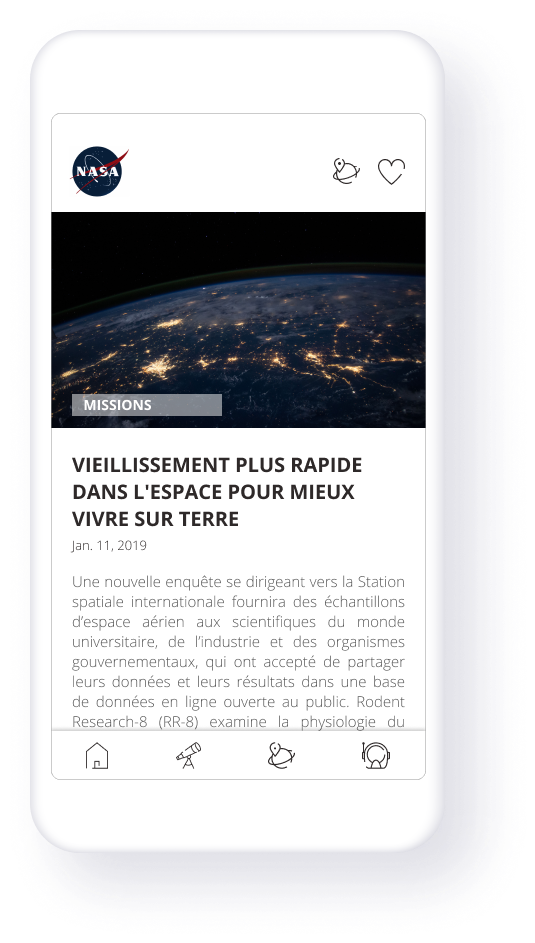
The objectives were to organize and prioritize the informations so users can easily find their way and avoid confusion. In addition, we wanted to improve the design, interactions with users and highlight their photos.
Elements to change
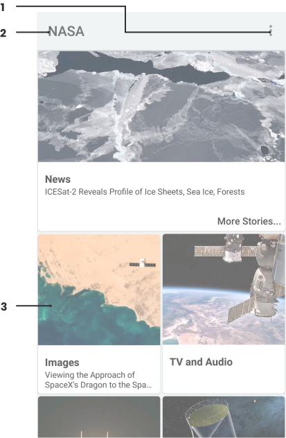
1. Menu which brings up the parameterso official logo
2. No official logo
3. Too much work between blocks
4. Unable to search or filter
A new user journey
The 6 to 1
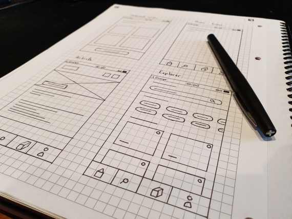
The 6 to 1 is a method often used in co-design workshops which allows to materialize the solution. Participants receive a brief and must make 6 interface proposals. Then, each of them presents their choices in turn, highlighting the solutions to user issues. Finally, participants must combine the most interesting solutions made in the previous step and converge on a single solution.
Once we developed a single solution each, we gathered the three interfaces, then selected all the essential elements to us and delete the remaining ones.
02.
CREATION PROCESS
Redesign of the graphic elementss
Wireframes
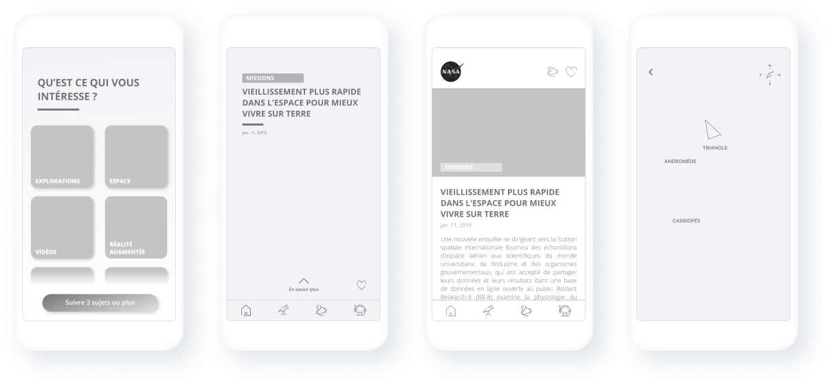
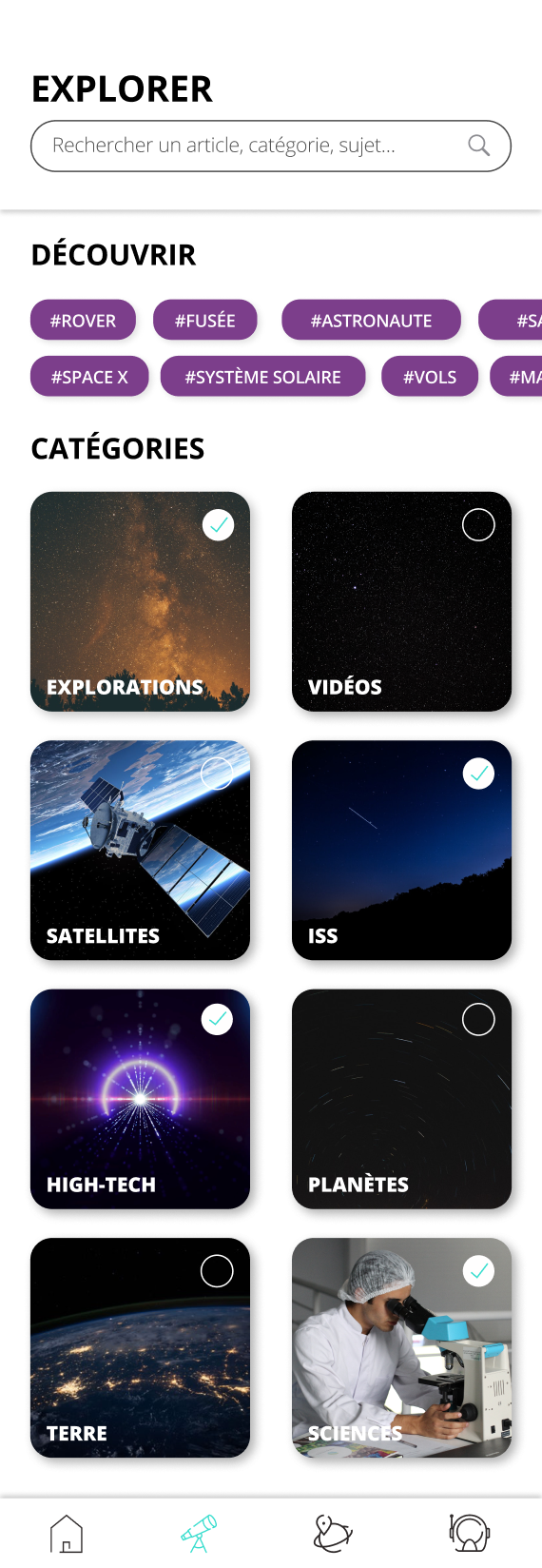
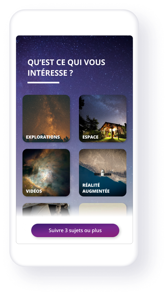
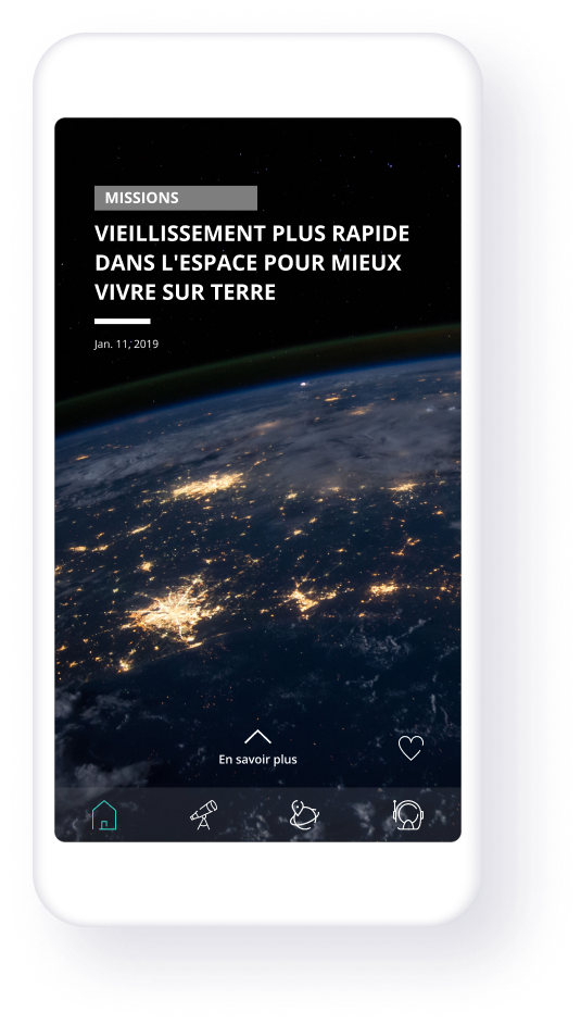
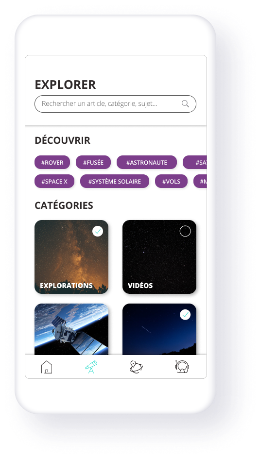
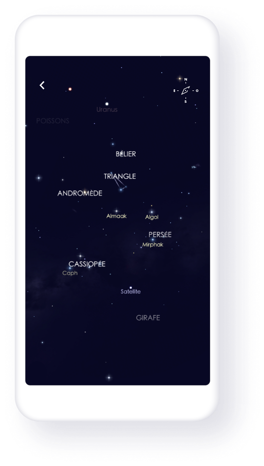
Through the redesign, the aim was to clarify the application. The navigation has been redesigned and reorganized. The users can navigate between the articles by swiping from right to left, they can also choose to subscribe to their favorite themes and discover new ones. An augmented reality section has been designed to allow users - via its geolocation - to discover where the planets are located above them.
Digital,
Universal, &
Dynamic
Blue
#262755
Dark purple
#941965
Turquoise
#37DDCE
Grey
#2E2929
We decided to choose a sans serif typography that was simple, pleasant and above all legible. We applied it with different weights on titles and body text.
AaBb
Open Sans
Light
The quick brown fox jumps over the lazey dog.
Regular
The quick brown fox jumps over the lazey dog.
Bold
The quick brown fox jumps over the lazey dog.
ExtraBold
The quick brown fox jumps over the lazey dog.
OUR approach
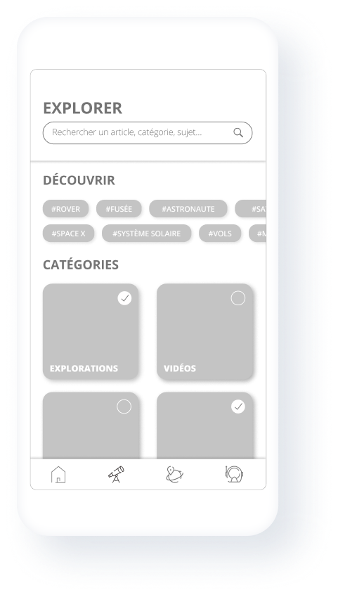
To capture the true essence of NASA's values, we developed a personalised mobile experience with very good visuals highlighted in full screen. We were determined to create an experience that allows users to discover new and interesting topics.
Each launch (use?), he finds a new subject he can consult or save in his favourites for later. He can also search for an article, subscribe and unsubscribe from topics.
We also wanted users to be able to immerse themselves as much as possible in a space environment experience which is why we added an augmented reality functionality. By moving his phone, the application allows him to locate the stars, planets, constellations around him.
Let's Do This.