Client
24h OF insa
tasks
visual identity, communication supports, print
contributors
How to create a coherent visual identity adapted to different audiences ?
24h of Insa
From a bike race to a music festival
What is the 24h of INSA?
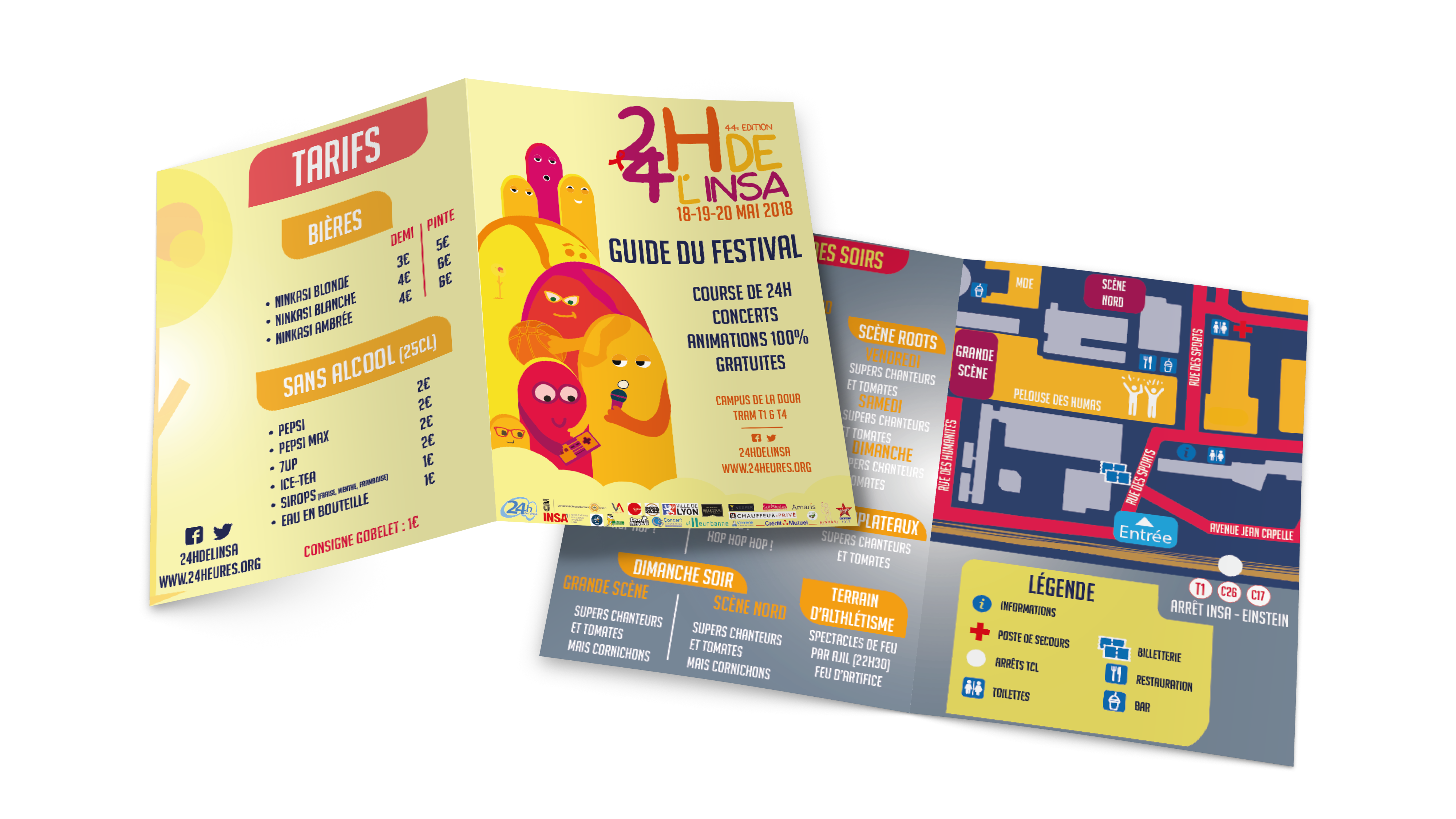
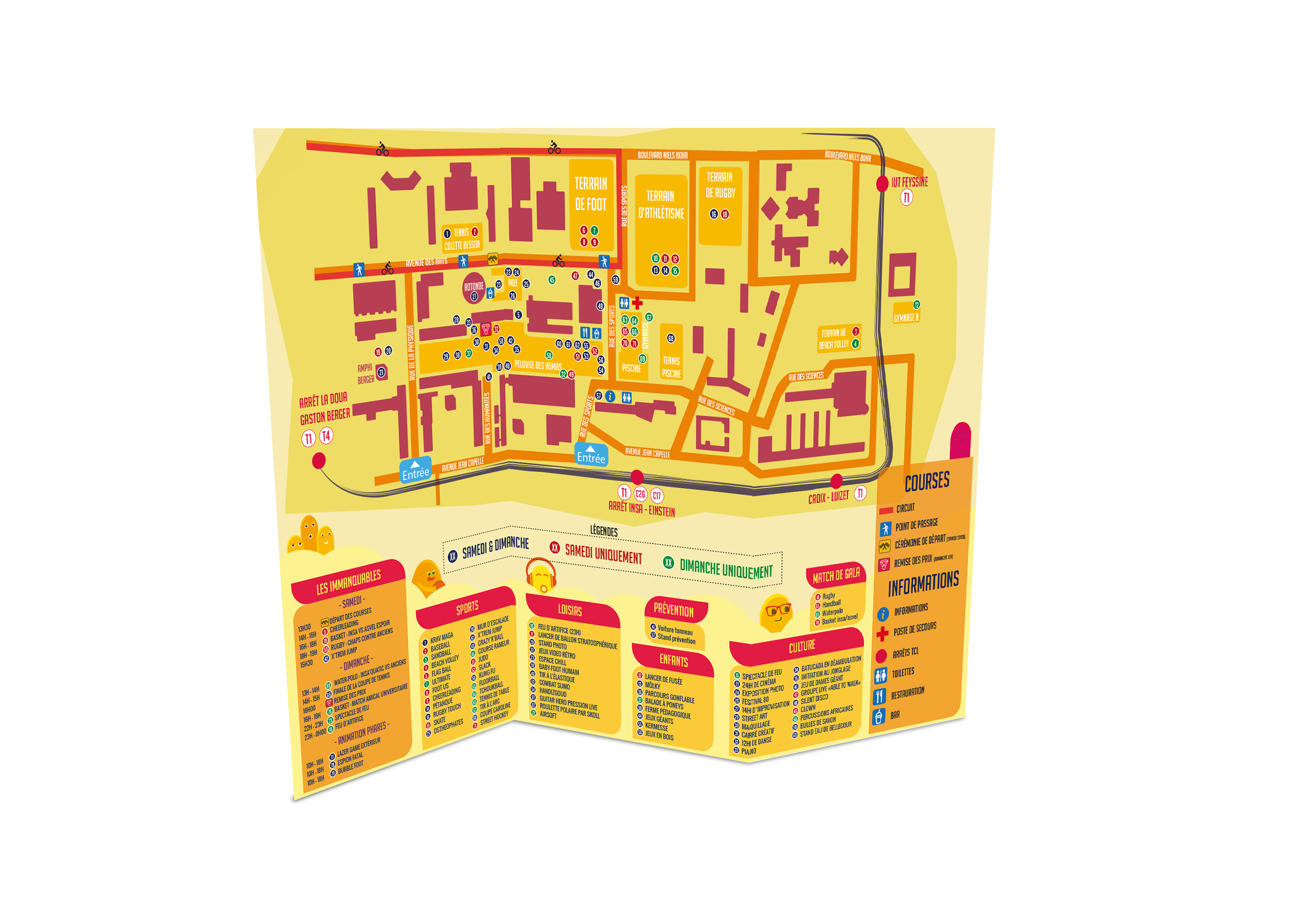
The 24h of INSA Lyon is a non-profit association which was created on January 8, 1981. This idea born in 1972, when two INSA students set themselves an insane challenge: to cycle around their residence for 24 hours. Today, it is one of the biggest student festivals in France which attracts nearly 40,000 festivalgoers over three days. The festival is organized around four major areas: 24-hour races, cultural, sporting and entertainment activities during the day, prevention and concerts in the evening.
the challenge
As every year, the 24h of INSA wanted a new visual identity for its 44th edition. We responded to the invitation to tender and had 1 week to produce all of the festival's communication media. The peculiarity of it is that it takes place both day and night. We had to produce visuals dedicated to the day which enhance the entertainment and family spirit as well as visuals for the night which are more oriented towards concerts and the festive atmosphere.
01.
CREATION PROCESS
Transcription of the festival values
Happy,
Warm, &
Optimistic
Corn
#F8EB60
Saffron
#F9B629
Carrot Orange
#F08722
Cinnabar
#E6413A
Alizarin
#E12443
Crimson
#A3195B
Paris M
#1D2353
We decided to choose two sans serif typographies for this 44th edition of the festival. The aesthetic of the Nerdy Norms typography lent itself perfectly with the graphic style that we chose, with an offbeat, festive and accessible contribution to all. The second, Bignoodletitling, went well and brought a more serious touch.
AaBb
Nerdy Norms
Regular
The quick brown fox jumps over the lazey dog.
OUR APPROACH
Our aim was to offer the festival a new approach thanks to a new graphic organization on communication media.
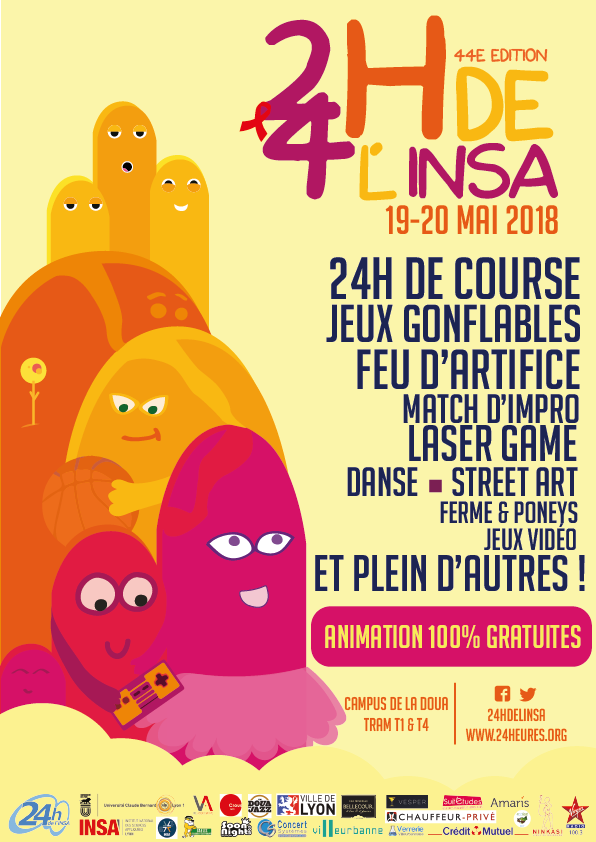
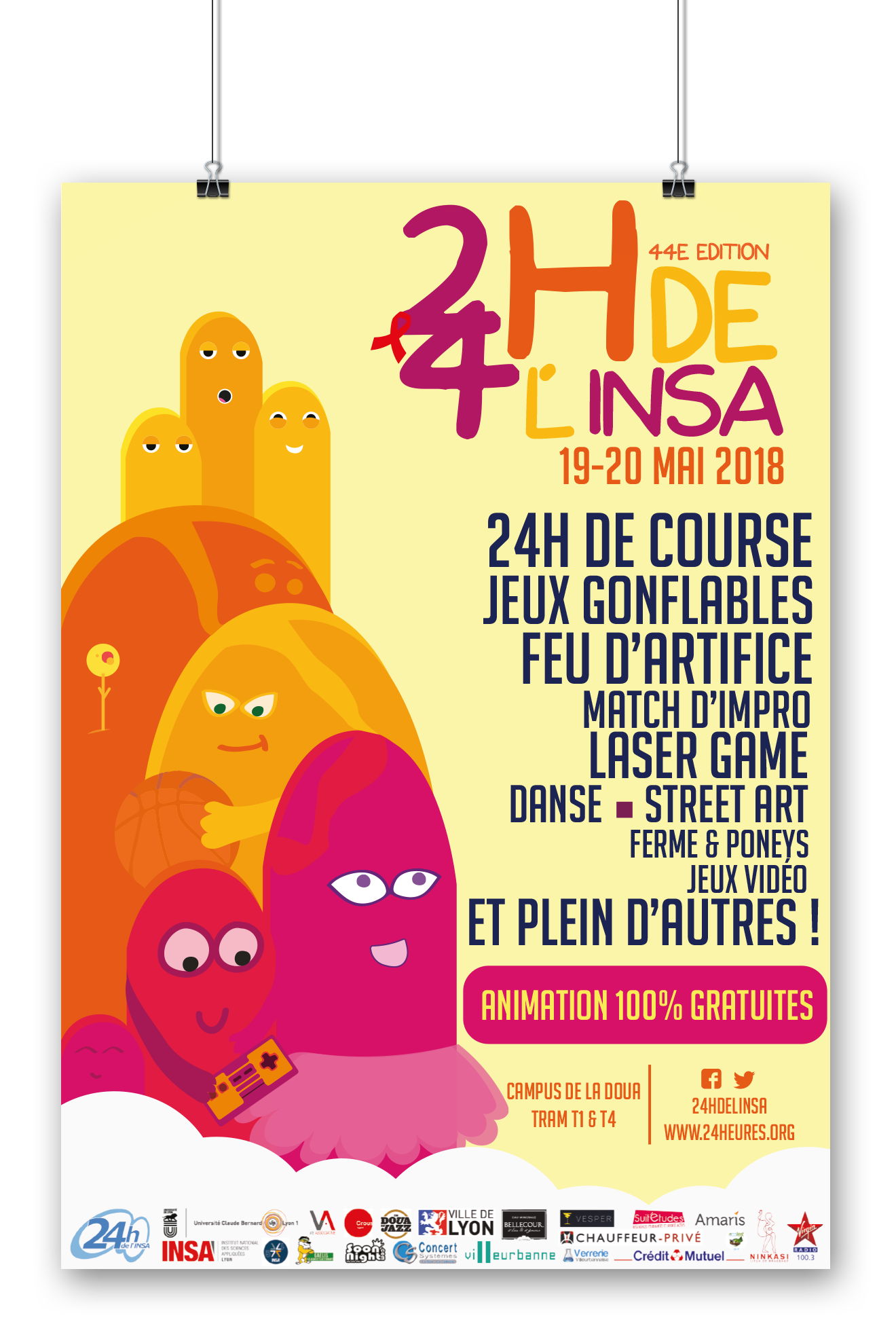
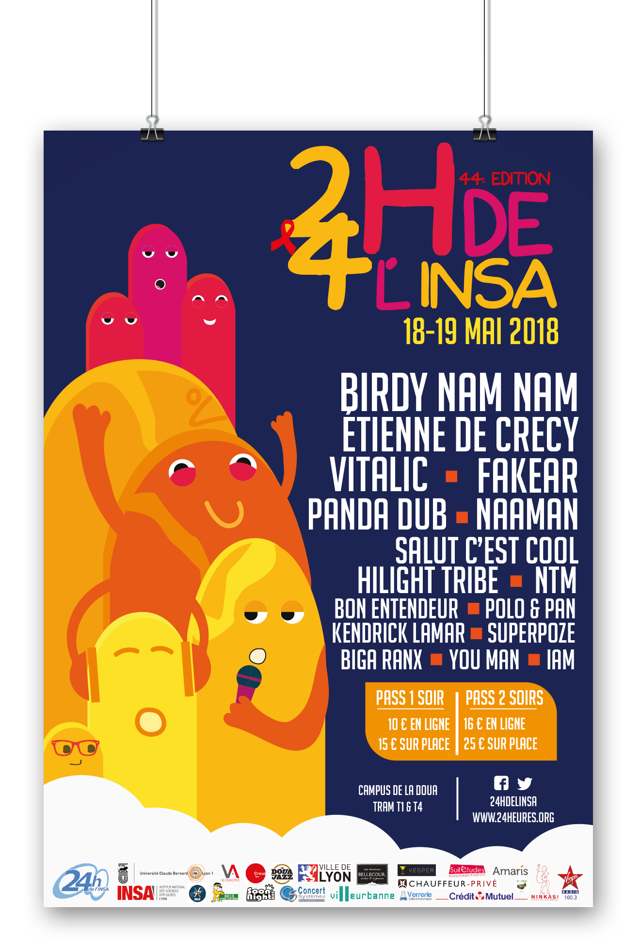
For the posters, instead of putting the illustration above and the text below, we made the decision to illustrate the left part, so the text occupies all the right part. This led us to an illustration based on the height that breathes upwards and catches the eye. The mountains lend themselves well to this vertical layering game and we decided to humanize them to give them a playful and festive side.
The bright and cheeky colours give the daytime poster a childish and cheerful look, inviting to come and have a good time. The night colours are warm and always festive, the guys keep their cheerfulness and it gives a real desire to go and participate in the different evenings.
The humanization of mountains is intergenerational and allows everyone to get attached to it by interpreting the forms the way they want.
We tried to explore a new style, more quirky and festive to move away from the previous “realistic” posters.
Let's Do This.